


CSS Grid Layout represents a revolutionary approach to web design, significantly enhancing the capabilities of CSS in creating complex, responsive layouts. As a two-dimensional system, CSS Grid Layout allows both rows and columns to be defined and controlled, offering a level of layout precision previously difficult to achieve. It’s part of a new generation of CSS technologies, including CSS Flexible Box (Flexbox), that aim to simplify and streamline web layouts. Unlike traditional layout methods, the Grid Design and CSS Grid System offer a more efficient and straightforward approach to arranging web content, revolutionizing the way web grids and CSS layouts are approached.
The Structure of CSS Grid Layout
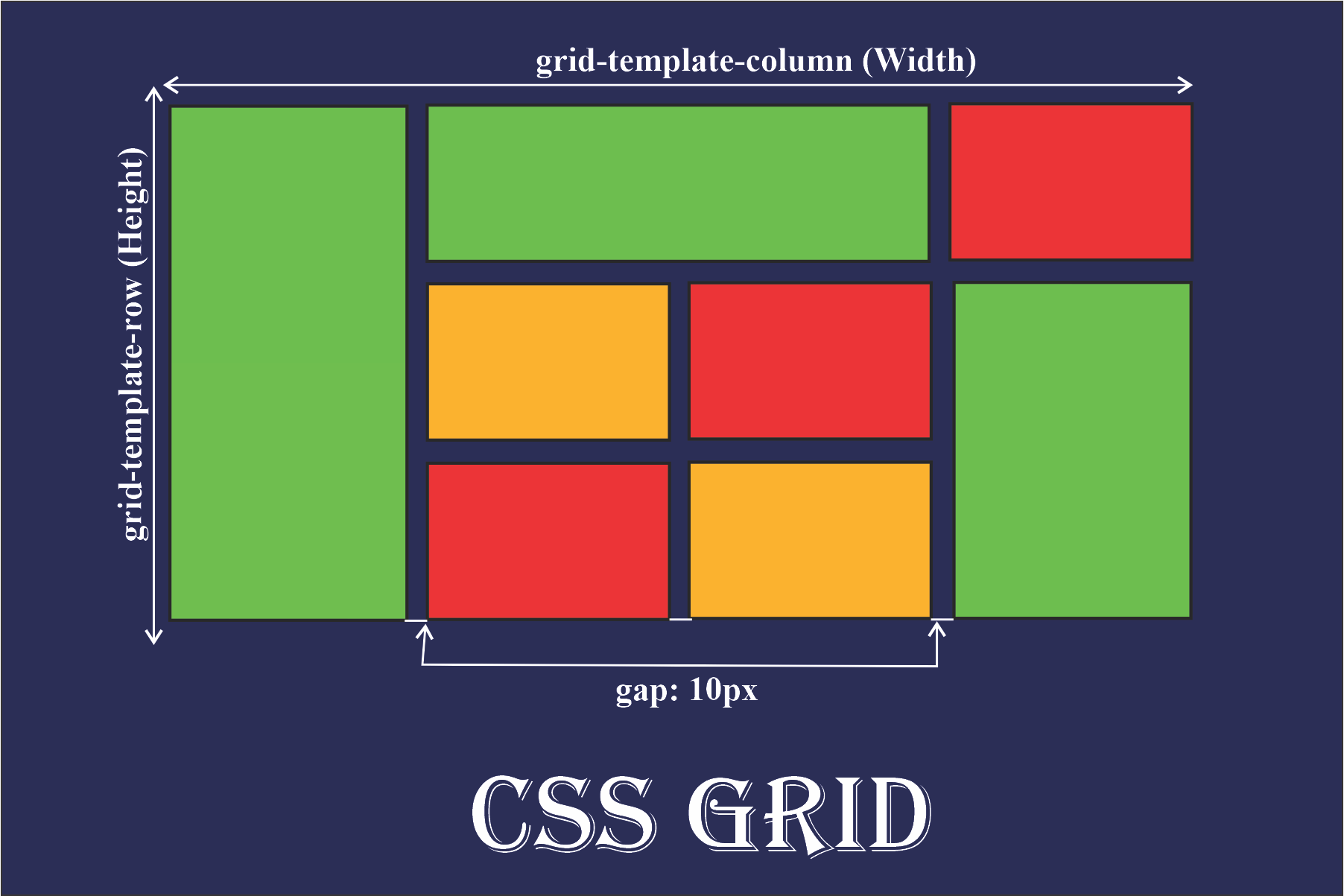
The CSS Grid Layout Module introduces a variety of properties that enable intricate grid structure designs. It allows web designers to define grid template rows and columns, create grid template areas, and control the sizing and spacing of grid items. Grid Template Columns and Grid Template Rows are fundamental aspects, allowing the specification of column widths and row heights. The Grid Template also includes the definition of CSS Grid Areas, which are named regions of the grid to place items. The flexibility and control provided by these features make the Grid Layout Module an essential tool for modern web design.
Grid Layout vs. CSS Flexible Box
While both CSS Grid Layout and CSS Flexible Box (Flexbox) are powerful layout tools, they serve different purposes. CSS Grid is designed for two-dimensional layouts – where control over rows and columns is needed. In contrast, Flexbox is better suited for one-dimensional layouts, either in a row or a column. Flexbox excels in aligning items within a container and distributing space, whereas Grid Layout is ideal for creating complex page structures. Both are part of the CSS Display Module, but their usage depends on the specific layout needs of a web page.
Key Differences:
- Dimensionality: Grid Layout is two-dimensional (rows and columns), while Flexbox is one-dimensional (either rows or columns).
- Use Cases: Grid is best for overall page layouts, and Flexbox is for aligning and distributing items within a container.
Responsive Design with CSS Grid
One of the most significant advantages of the CSS Grid Layout is its ability to create responsive web designs. The Grid Auto Rows and Grid Column features play a crucial role in this. They allow the grid to adapt automatically to different screen sizes, enhancing the responsiveness of web layouts. Responsive columns and automatic grid rows adjust the layout dynamically, ensuring that the web content is accessible and aesthetically pleasing across a range of devices. This adaptability is a key component of modern web design, making Grid Layout with CSS an indispensable tool for web developers.
Advanced Features of CSS Grid Layout
The CSS Grid Layout Module goes beyond basic grid structures, offering advanced features for intricate web designs. Grid Template Areas provide an intuitive method of designing complex layouts by defining areas within the grid. This, along with Grid Column Structure and Row Arrangement capabilities, allows for detailed control over the layout. Additionally, the CSS Grid Inspector tools available in many development environments aid in visualizing and fine-tuning the grid layouts, making the design process more efficient and precise.
Key advanced features:
- Grid Template Areas: Allows defining specific areas in the grid for content placement.
- Grid Inspector Tools: Facilitate the visualization and adjustment of grid layouts during development.
The Impact of CSS Grid on Web Design
The introduction of the CSS Grid Layout has had a profound impact on web design. It simplifies the creation of complex layouts, reduces the need for external frameworks, and provides a native, standardized method for building web layouts. This has not only improved the efficiency of web design but also opened up new possibilities in terms of layout creativity and innovation. The Grid Layout with CSS represents a significant step forward in web design, offering a more flexible, powerful, and intuitive approach to creating web page layouts.
Conclusion
In conclusion, the CSS Grid Layout is a transformative feature in the world of CSS and web design. Its ability to handle two-dimensional layouts with ease, coupled with its responsiveness and advanced features like Grid Template Areas and Grid Auto Rows, makes it an essential tool for modern web developers. As web design continues to evolve, the Grid Layout Module, along with other CSS technologies such as Flexbox and the CSS Display Module, will play a pivotal role in shaping the future of web layouts, driving efficiency, creativity, and accessibility in web design.
FAQ
More from CSS Guides


Comments (0)
Welcome to A*Help comments!
We’re all about debate and discussion at A*Help.
We value the diverse opinions of users, so you may find points of view that you don’t agree with. And that’s cool. However, there are certain things we’re not OK with: attempts to manipulate our data in any way, for example, or the posting of discriminative, offensive, hateful, or disparaging material.